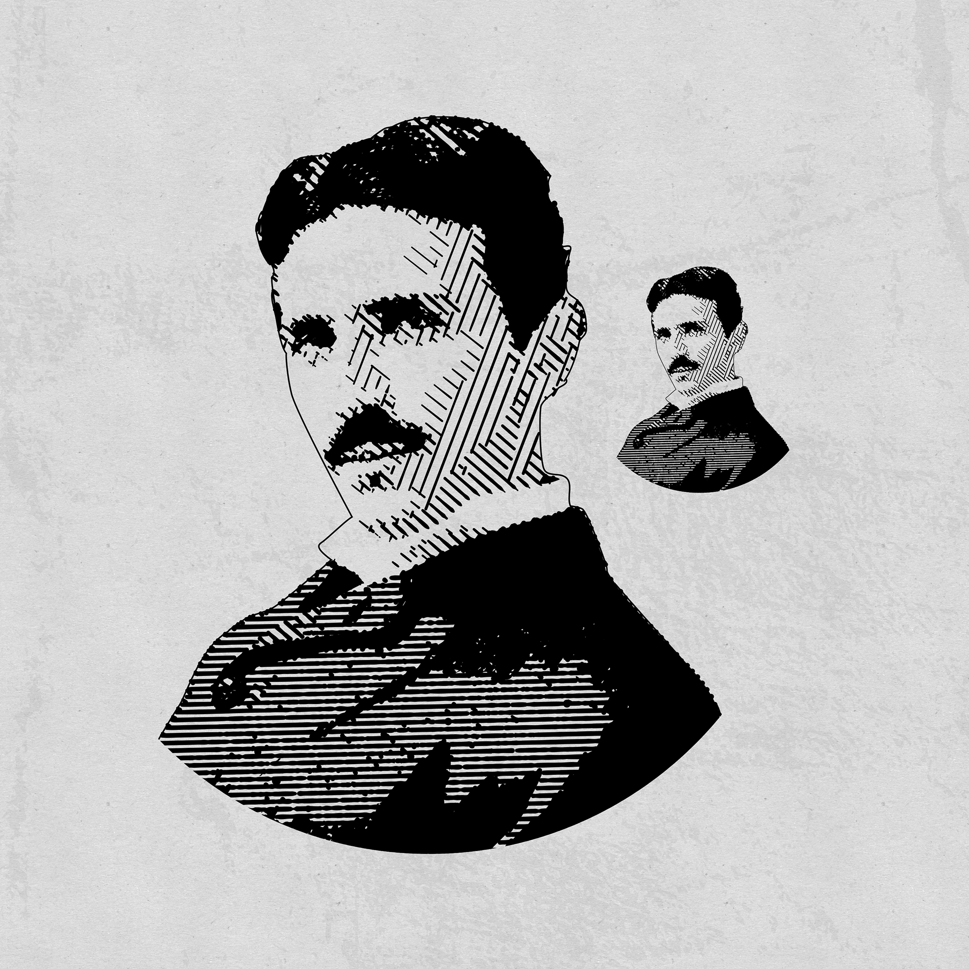
Nicola Tesla rendered programmatically in a modern digital engraving style by Colt.Ink
I love the look of 18th century engravings. I've spend a lot of time researching them, copying them, learning the various techniques Pen & Ink masters use to mimic them, and even making some of my own.
In the old days, it took weeks to concept, draw, engrave, and transfer these pieces onto paper. You had to use special implements to literally carve away the wood where you wanted white, leaving material where you wanted ink to be held, aka the "lines". This meant you'd be working in negative values and a reversed image, so that the paper could be pressed against the block to get the positive final image.
In the modern world, unfortunately, brand designers don't have the time to devote to lovingly crafting these images one by one if they need to be delivered at scale. For this reason, I decided to attempt to simplify the process with a script for Adobe Illustrator, which I though would be best suited to provide the most flexibility and customization for the final output.

For this example, I chose a neat AI reconstruction of Nikola Tesla posted to Reddit in r/StableDiffusion. Unfortunately, I didn't make note of the original poster's username, but I think they wouldn't mind me borrowing the image.

While not strictly necessary, sometimes it's helpful to prep the image in Photoshop just to ensure a nice balance of light areas and dark. I probably could have skipped Photoshop entirely for this image, but often it is needed to adjust cellphone photos.
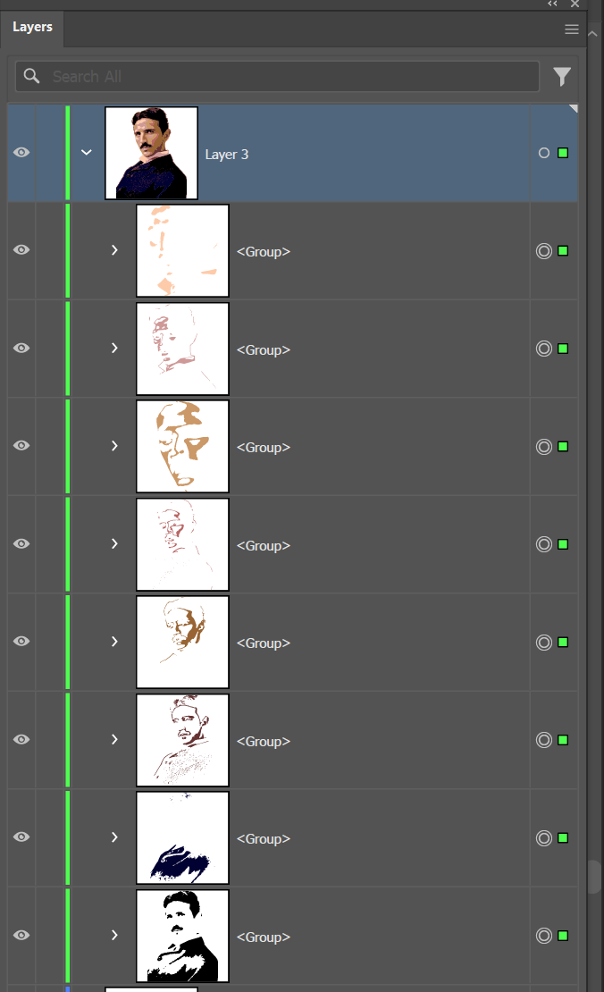
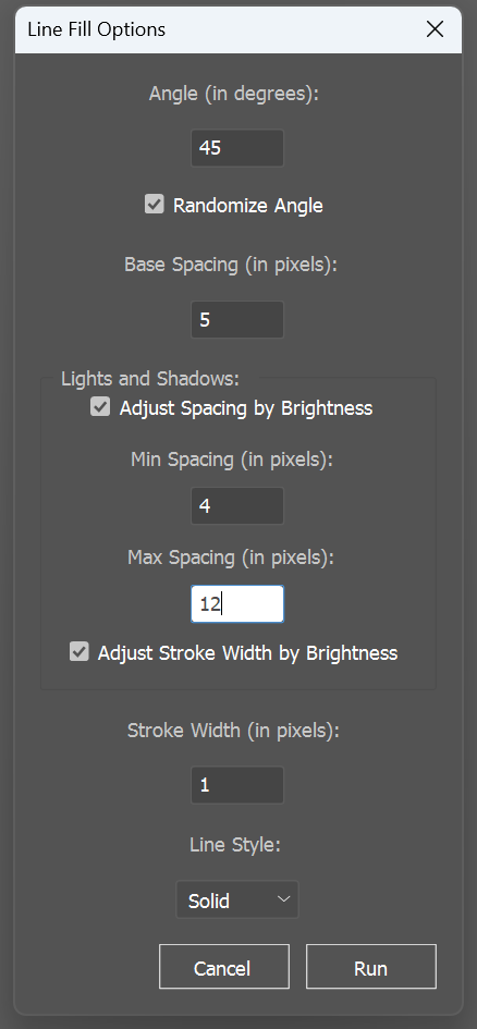
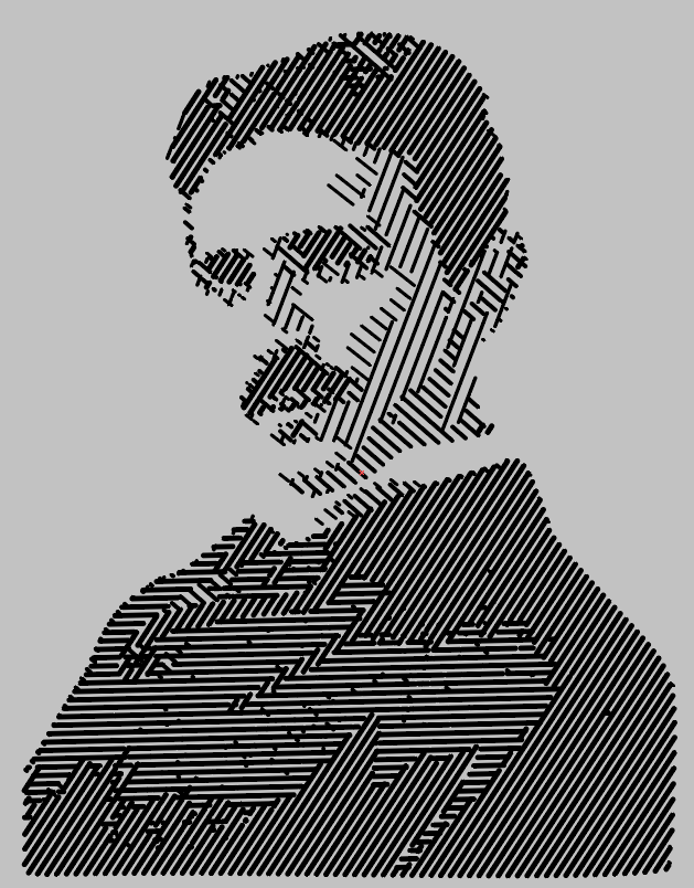
In Illustrator, I trace and separate the values of the image. This process doesn't have to be beautiful, it can be done quite quickly. Then, we run the script with some estimated settings. I added a "randomize angle" feature for fun, but I find that it does a good job of adding visual interest and indicating tonal transitions where the tones are very close.
This script is very much still in progress. At its most basic settings, it fills the shapes on each tone layer with lines, The shapes are saved, so it's non-destructive, but the final output is just groups of lines for each tone it was given.
To improve the effect, I created a function that checks the relative brightness of each tone, and dynamically changes the spacing of the lines so that dark areas are more dense, and light areas are more open. Using the same logic, we can also change the stroke weights to further sell the effect.
Depending on the size and complexity of the source image, I often have to give it a few tries while I dial in my settings.

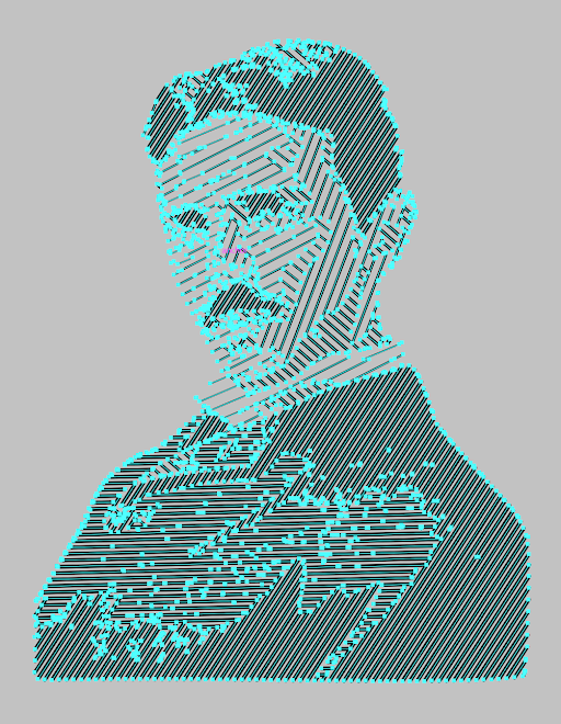
Note that the original shapes are hidden, and each line (stroke, not fill) is cropped exactly to the correct boundary. This was a challenge to figure out how to achieve, especially in a way that doesn't overwhelm and crash Illustrator. This output gives me the absolute maximum control over the image I can get. From here, I can manipulate the lines or outline them and run creative processes on the fills.

Once I have the result I like, I often remove shades I think are extraneous or confusing to the eye, and I like to add the black fills back it to lower the compute cost. Depending on the results, sometimes I like to add an outline in to offer more definition.
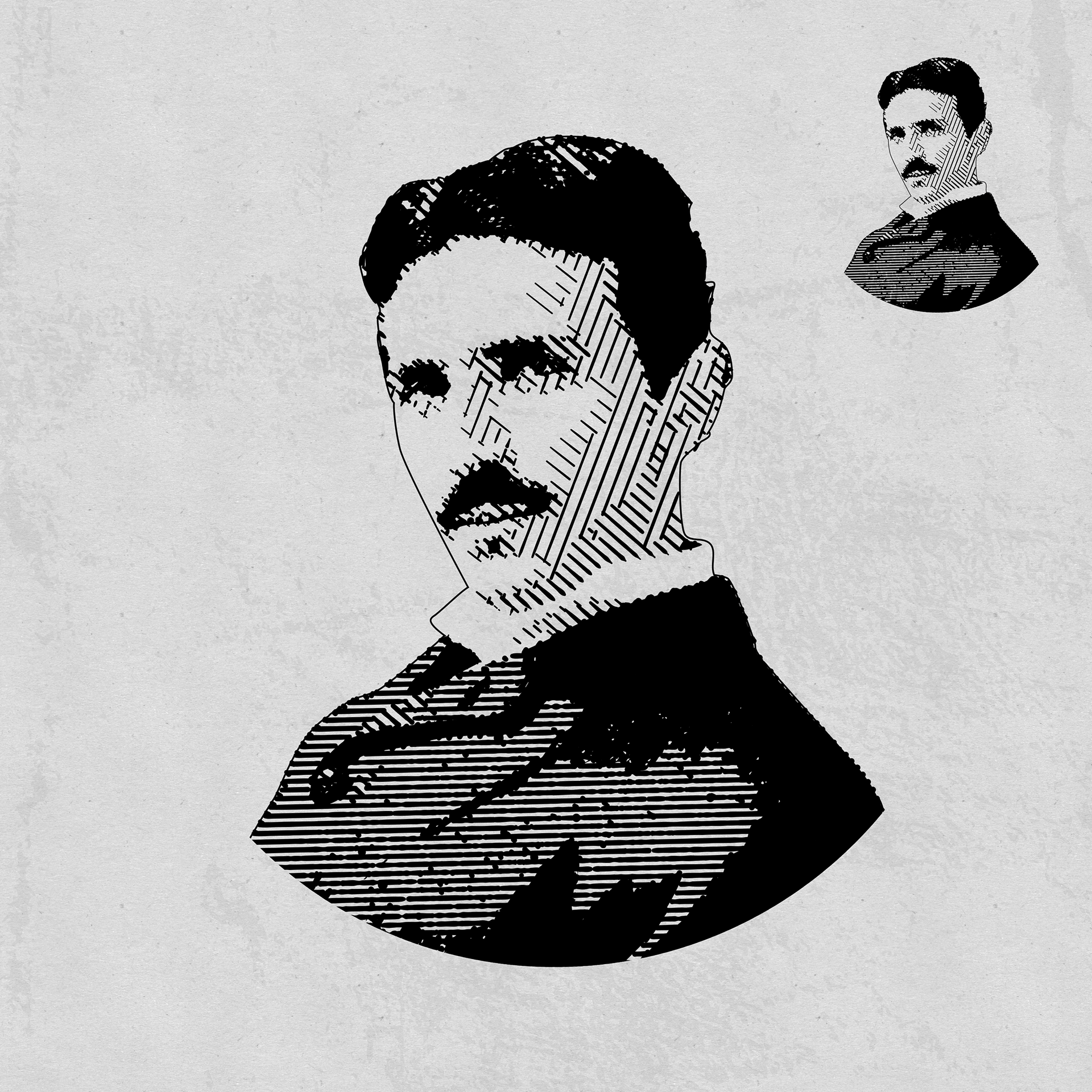
In the final stage, I further improve the image using tools like Half Line (scriptsfordesigners.com) or Width Stamp (Astute Graphics) to create the "swelling line" effect engravers often made use of in their work.
This is just a quick demo on what I've been developing, I plan to show off some designs I've created for my own enjoyment using this technique, so stay tuned!
This is just a quick demo on what I've been developing, I plan to show off some designs I've created for my own enjoyment using this technique, so stay tuned!