An established strength training gym in Portland, OR wanted a brand refresh and to develop a new streetwear brand.


In early discussions, the team at Ironside knew they wanted to project grit, strength, and rebelliousness.

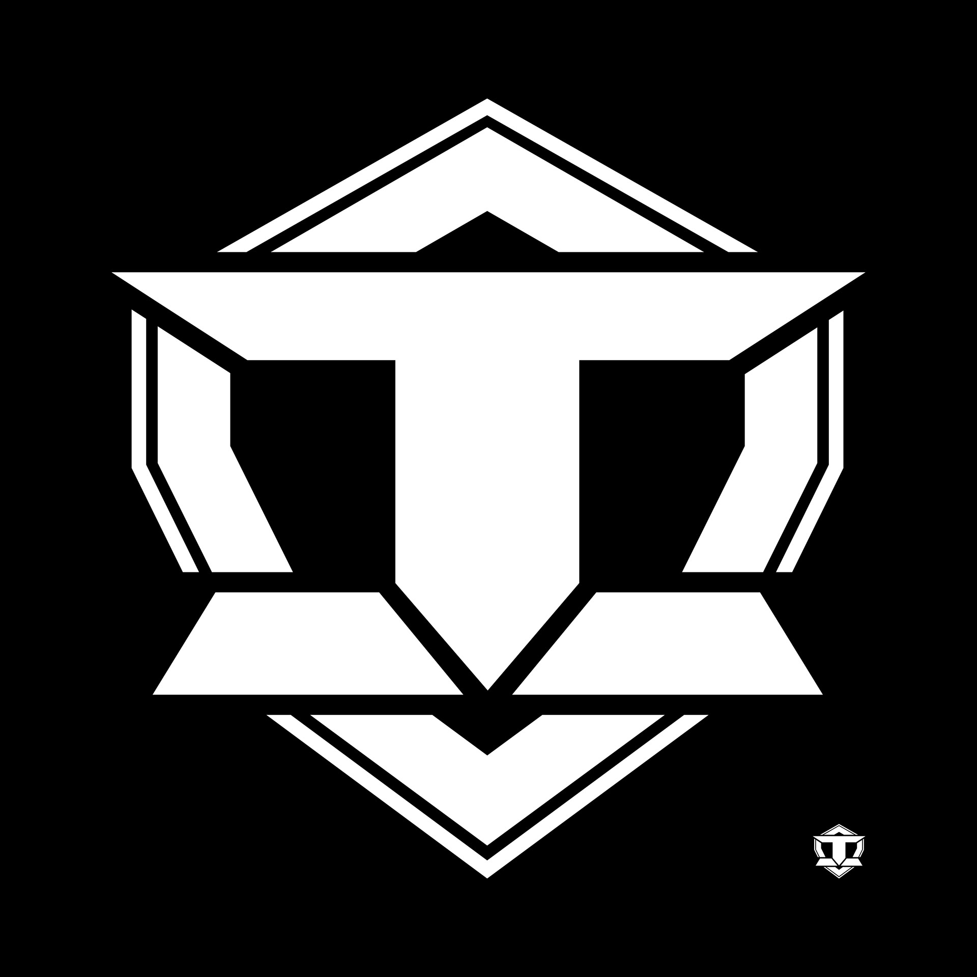
The first initiative was to reimagine their logo, an "I" in a shield.

The original logo, created by the gym's founder, was interesting and strong. I wanted to preserve its basic elements, but make it more iconic. It was too boxy, and scale was a problem - it wasn't legible at a smaller size, and the negative space seemed wasted.
We took some inspiration from various superhero logos to develop a bolder, more standalone symbol. The "I" was shortened and made more stout, with its baseline and cap bars being given a more dramatic angle. This represented the "I" and "T" better by differentiating the two components more clearly. The stout shape reflected the human body in a powerlifting pose. The shield was scaled down, text box dropped, and an extra inner border line added to give it some line variation, depth, and to call out to the superhero shields we liked.
The typography was left mostly unchanged except to add greater tracking, invoking some wonder and dignity.
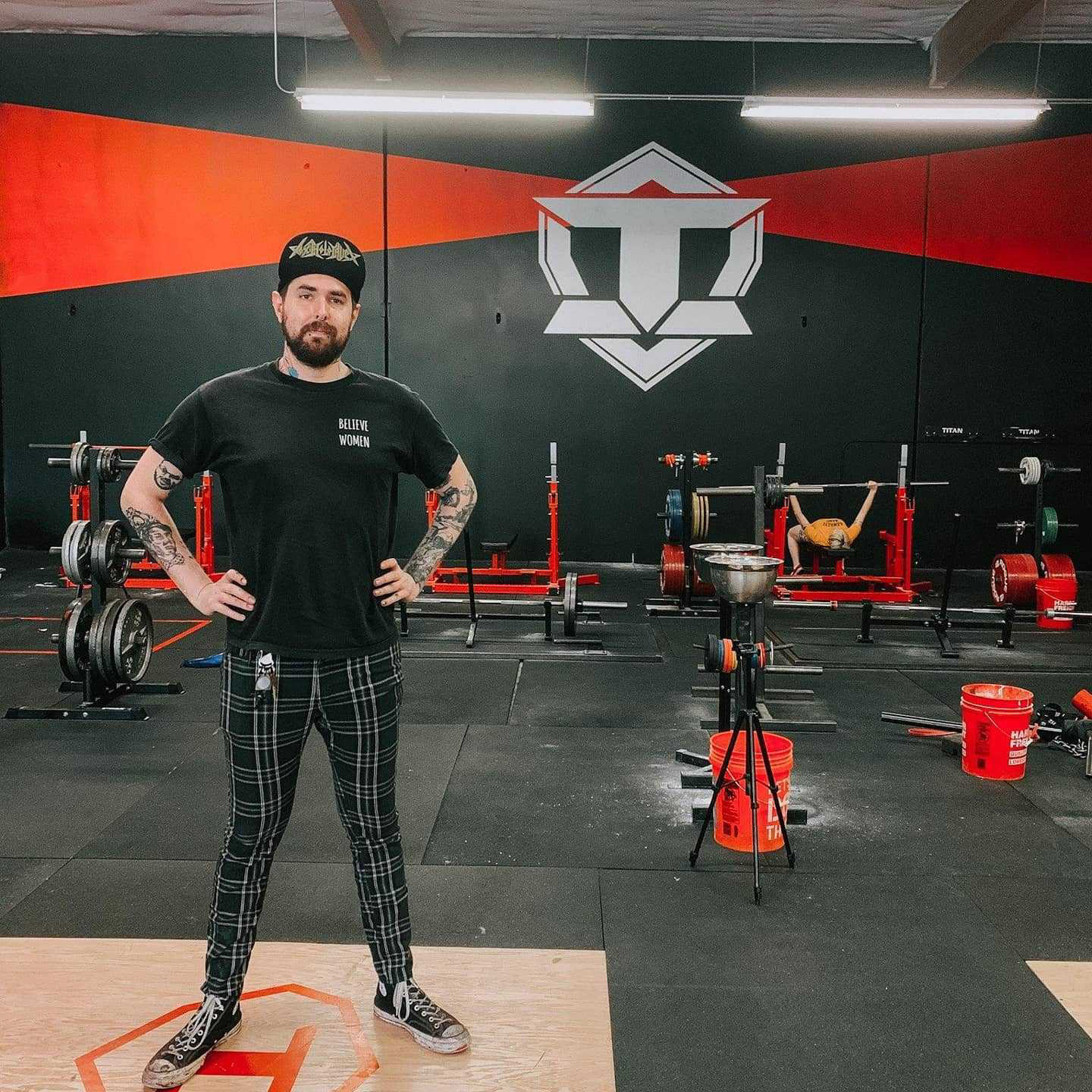
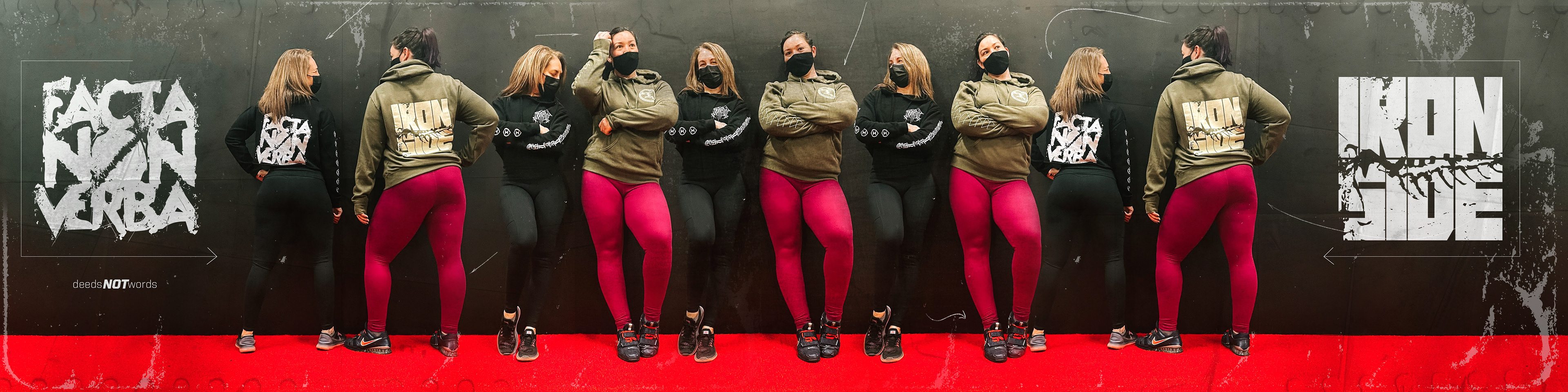
The interiors were adorned with the new logo and some brand elements.

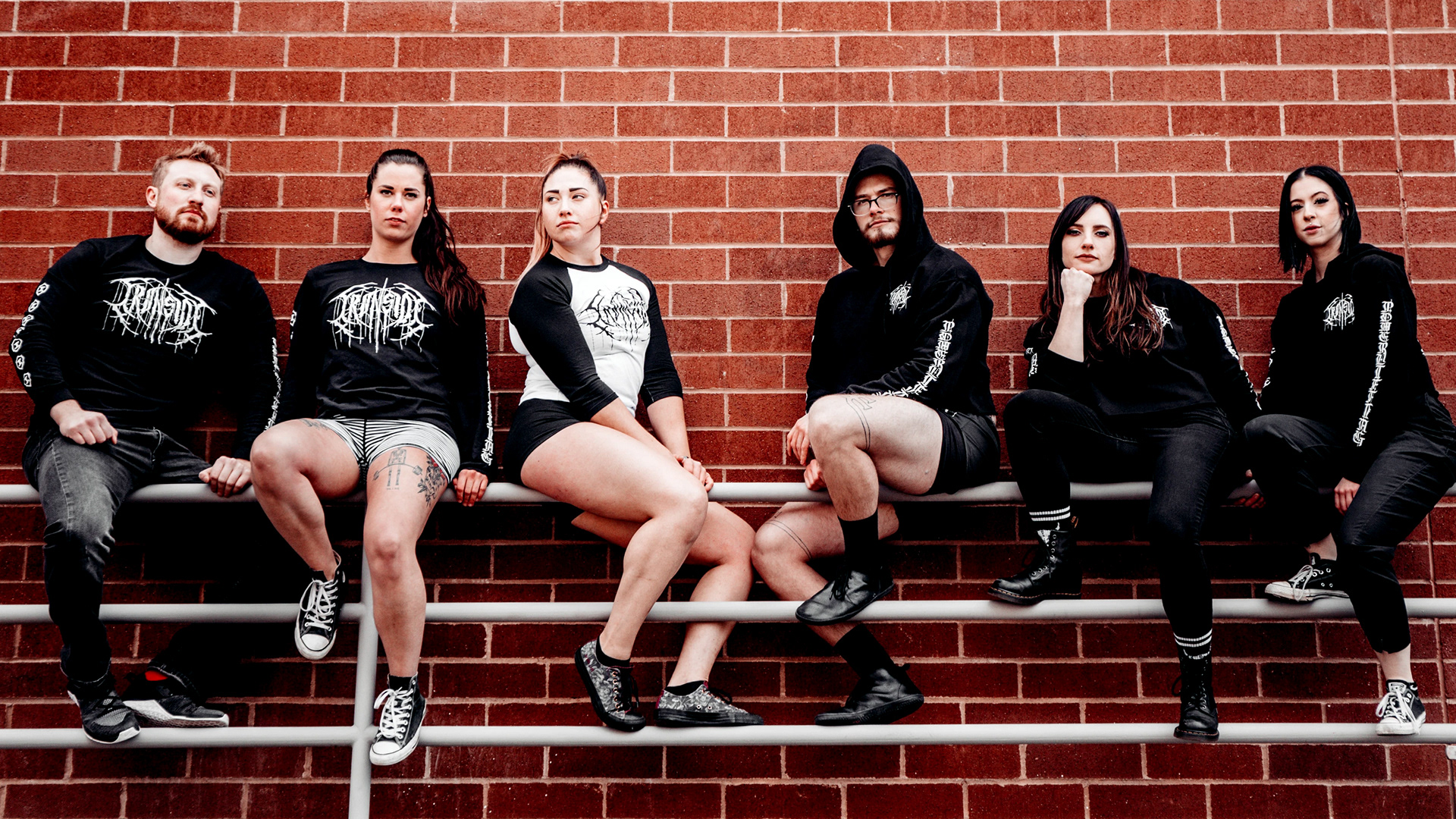
The design was also applied to team uniforms, which were worn at the Powerlifting Nationals. Ironside won several Gold in these new uniform designs.
Next, we began creating art for the streetwear apparel line.

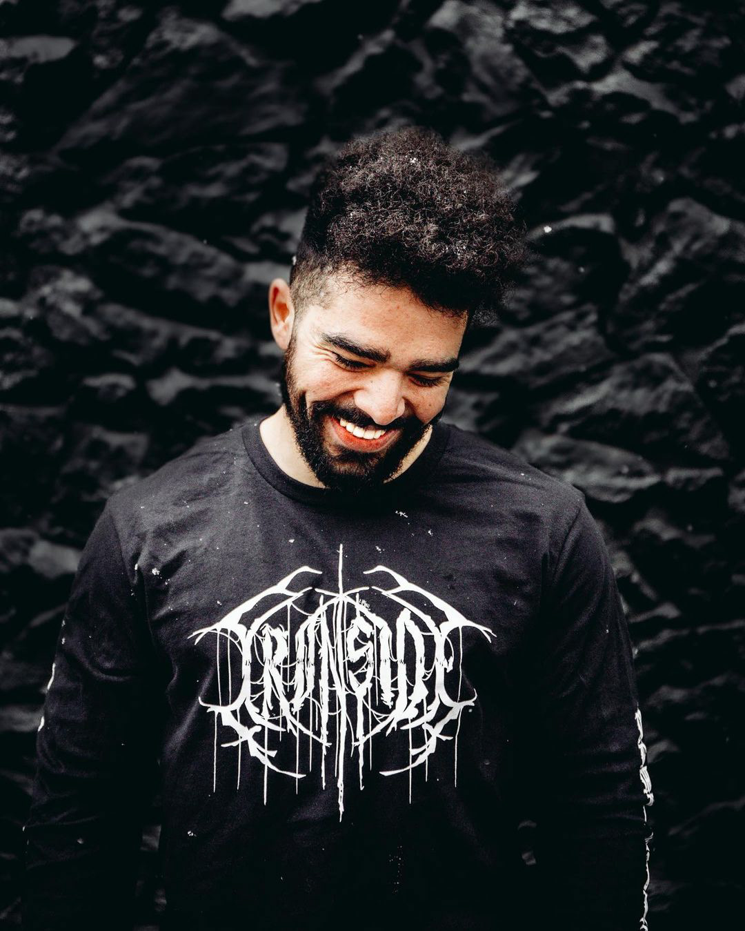
We announced the new line with a "Thrash" design inspired by 80's Heavy Metal artists. The goal was to project excitement and toughness, essential to the strength training world.
Similarly, we created a "Black Metal" design.
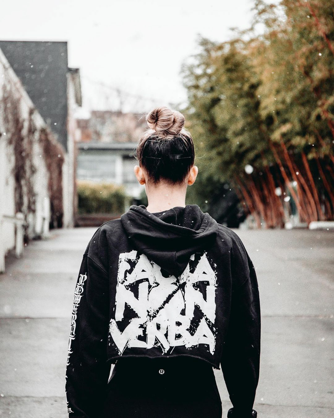
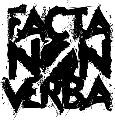
Another goal was to develop the slogan "Facta Non Verba" (Deeds, Not Words) as a brand property. This design was meant to establish it and its association to the apparel line.

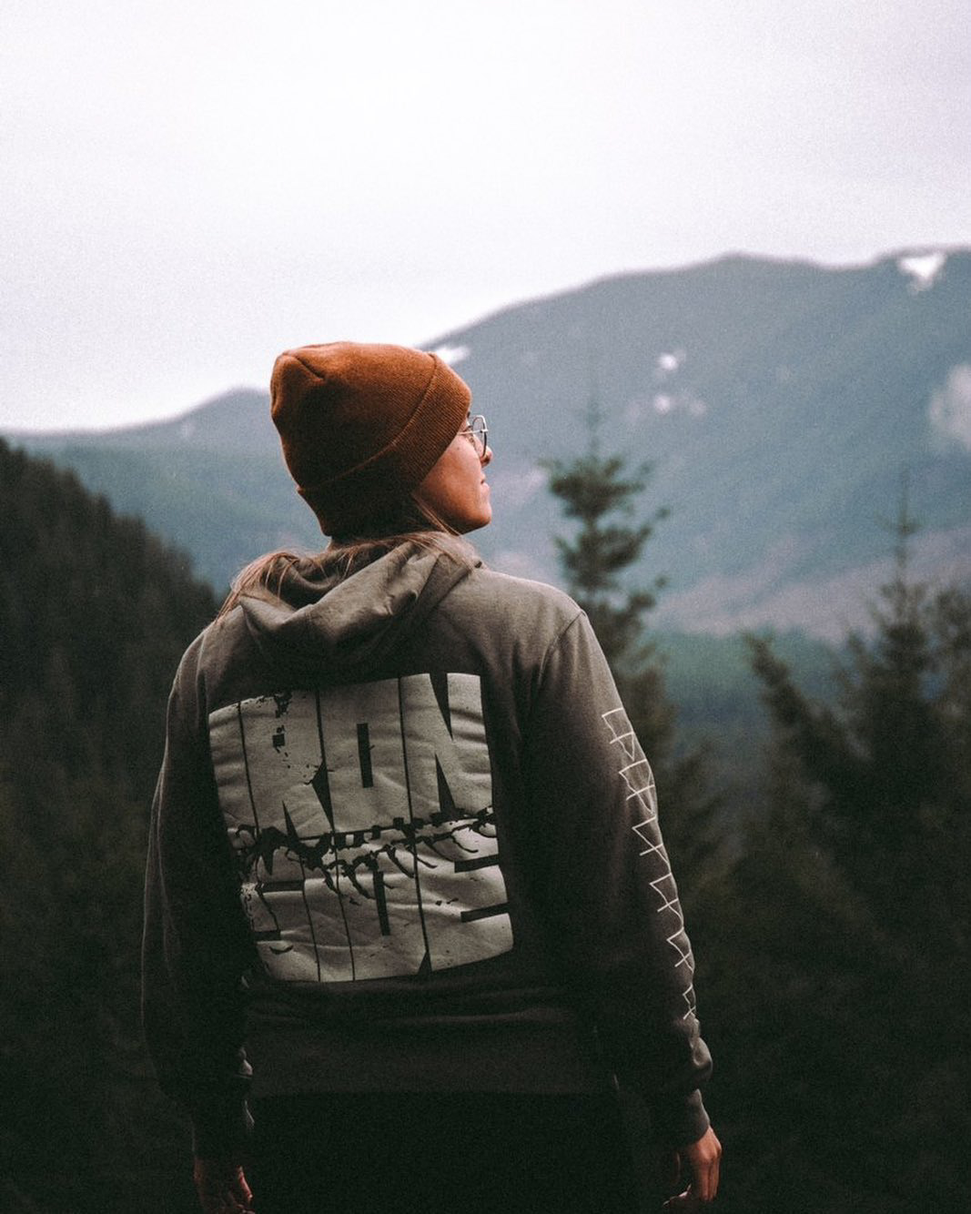
The two above were part of the "Elemental Series" developed to show reverence for nature. Each release was themed after the elements (Fire, Wind, Water, Earth) as a metaphor for the many building blocks of strength and fitness.
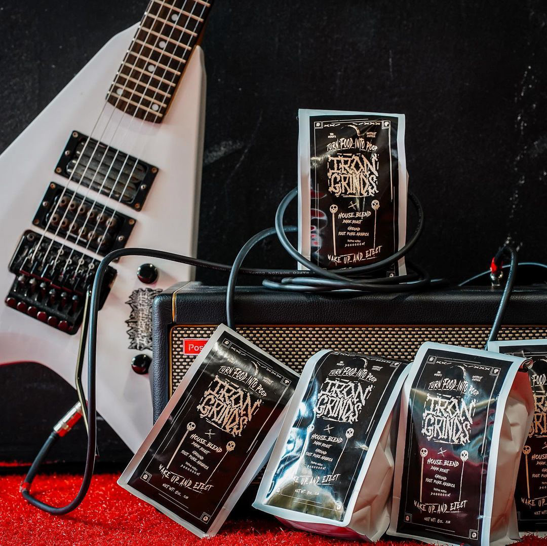
Ironside also began a coffee brand called "Iron Grinds". I was asked to develop a logo and label for the humorous brand.
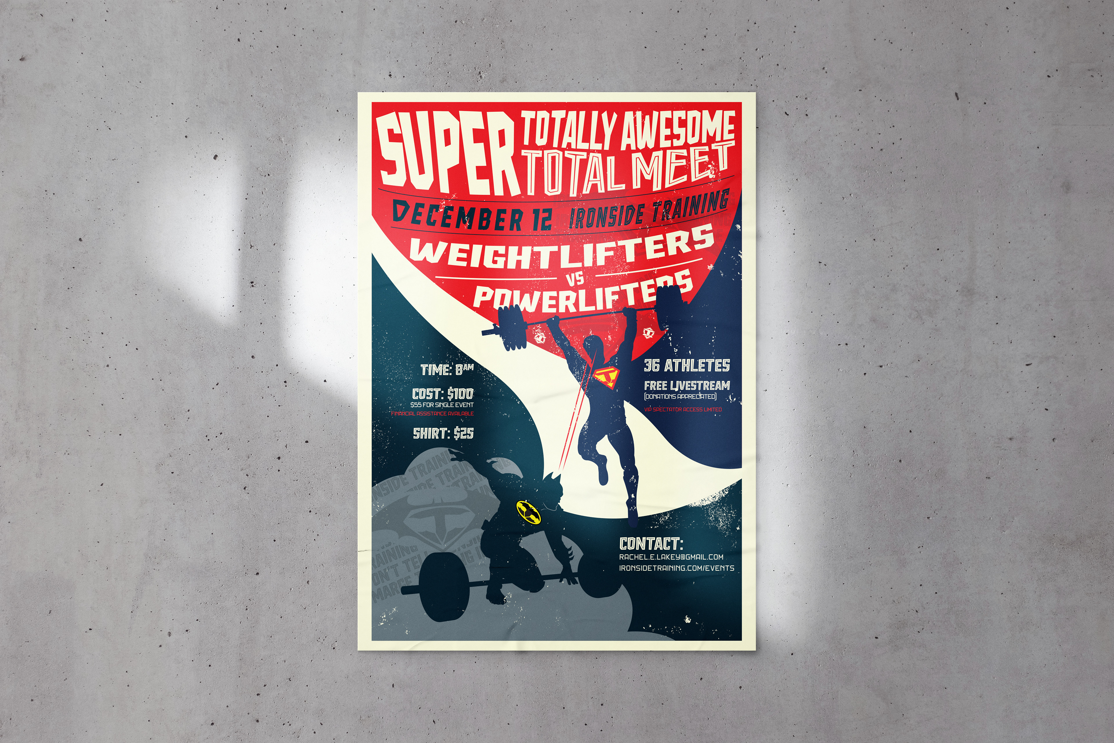
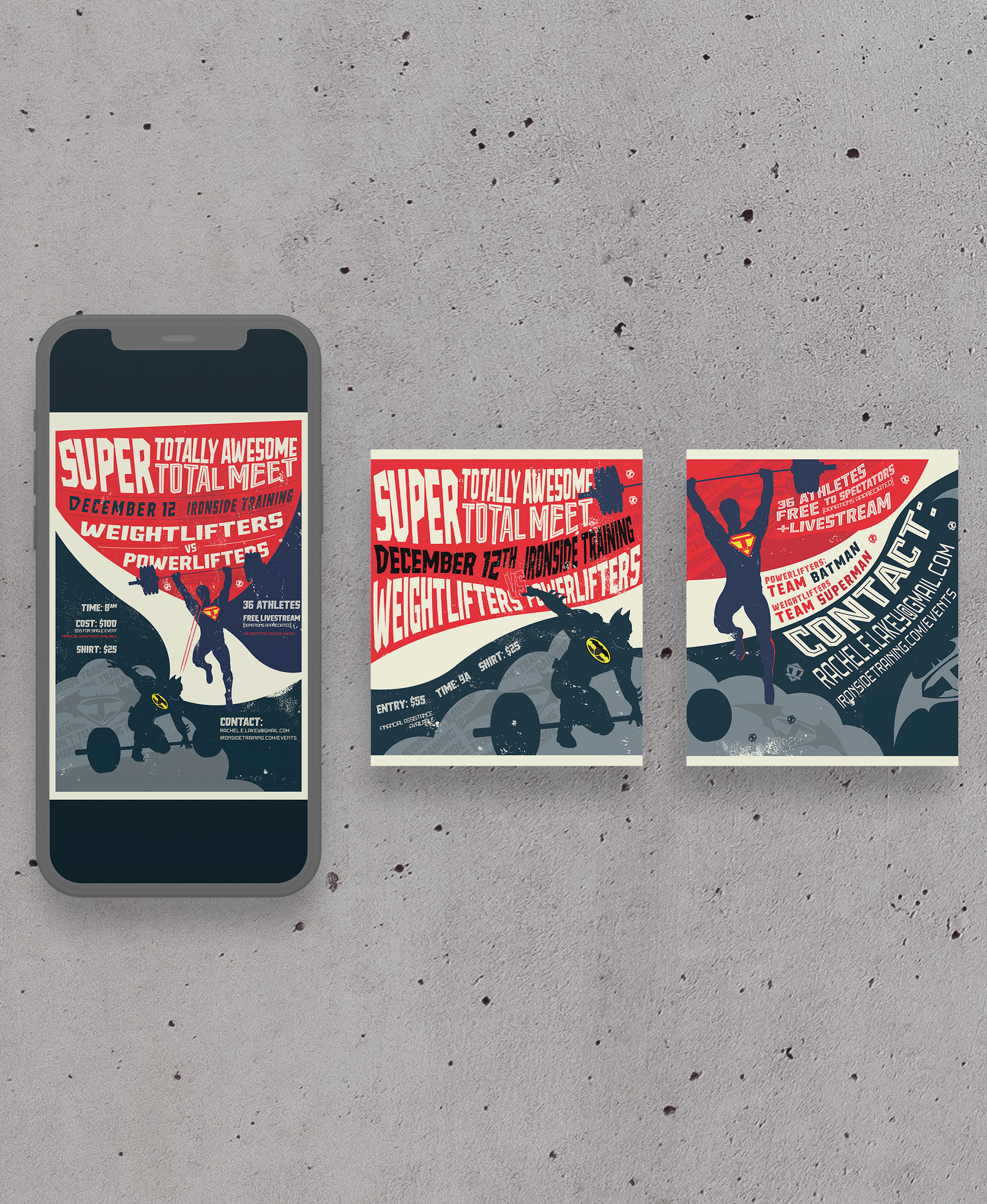
A personal favorite project was a poster for a "Supertotal" competition hosted by the gym.
The design features two classic superheroes to represent the Powerlifters and the Weightlifters, who would be competing. It also featured the chest pieces of the original characters adapted to the Ironside logo.